ICONS WITH IMPACT
When innovation moves fast, your visuals have to move faster.
Azure AI Foundry was expanding its AI capabilities and needed a bold new icon system to match. With new capabilities launching rapidly, they required a fresh set of icons – plus multiple versions of each – to support their growing product and marketing efforts.
AI Foundry’s Marketing and Product teams called on Allovus to help shape a visual system that could keep up. Together, we crafted icons that captured the complexity of their technology while staying clear, relatable, and ready to scale.
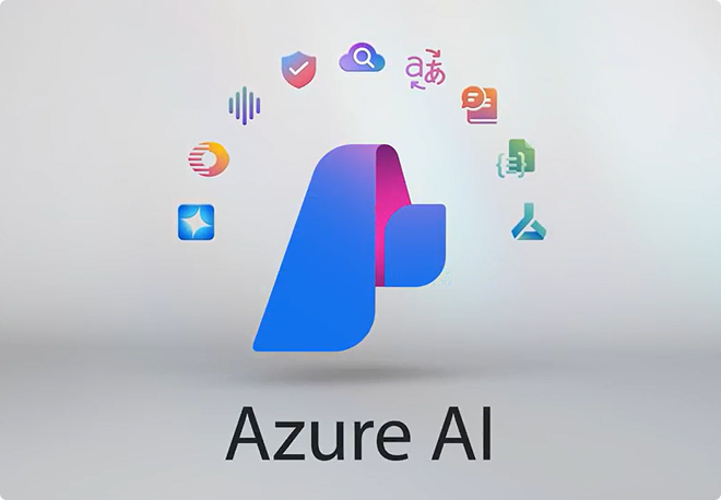
Azure AI Foundry powers developers to build high-quality vision, speech, language, and decision-making AI models. Now, their visuals move with the same energy and ambition as the technology behind them.
getting started: monoline solutions
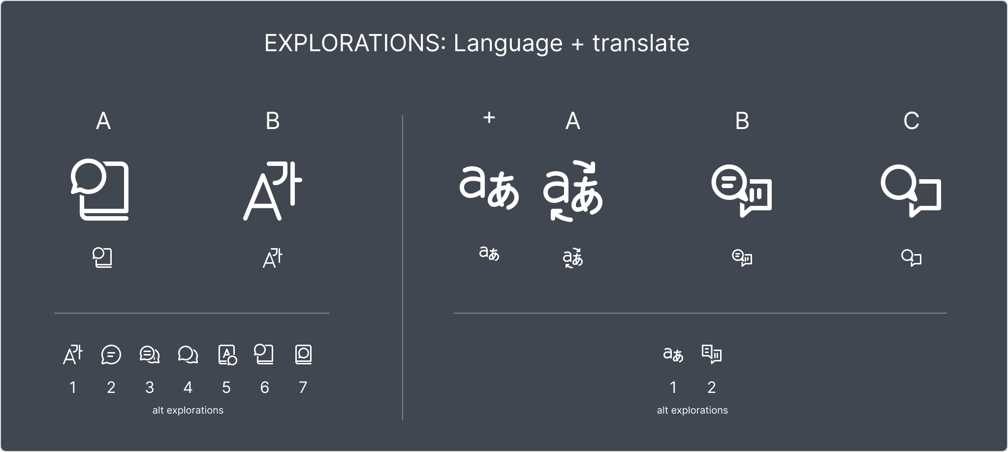
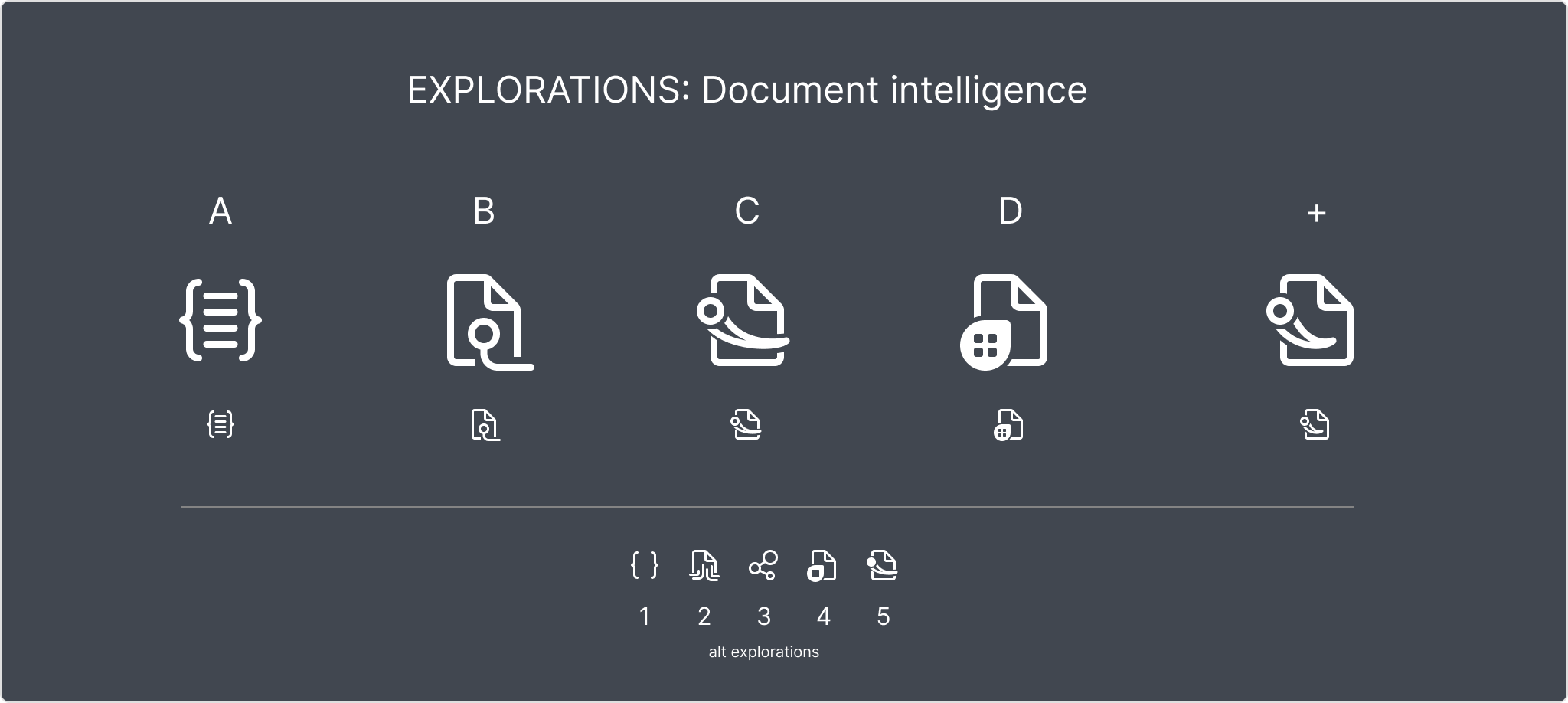
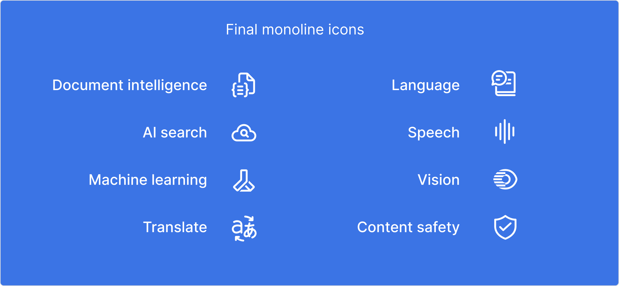
Our first challenge was to expand Azure AI Foundry’s family of monochromatic icons. The new concepts needed to represent Document Intelligence, AI Search, Machine Learning, and Translate – and they had to feel right at home within the existing system.
Both the Product and Marketing teams had a clear vision, but slightly different needs. Product needed clean, functional icons that performed well at small sizes. Marketing was looking for a style that could evolve into something more illustrative for broader storytelling. Our job was to find common ground.
Several rounds of early explorations laid the groundwork for deeper discussions. Each iteration helped us narrow the options, align stakeholder needs, and move toward a system that worked across both worlds.
ICONOGRAPHIC DISCS
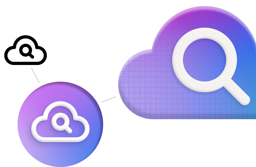
As Azure AI Foundry expanded its platform, more colorful, dimensional versions of the icons were needed for larger formats like web pages. Bigger sizes and distinct color treatments would not only add visual impact but also help guide users through the experience. Because the icons had to perform in both light and dark themes, we dove deep into exploring gradient values. Too light, and the white dimensional icons wouldn’t have enough contrast. Too dark, and the colors risked looking muddy or heavy. Finding the right balance was key to making the system feel vibrant, clear, and seamless across every environment.MARKETING ICONS
Brighter colors, dimensional details, and a shared grid structure brought the icons together as a cohesive, high-impact set. Designed with flexibility in mind, the Marketing team can use them at large sizes, allowing for more depth in shading, texture, and visual storytelling. The final versions align with the established color gradients from the disc-style icons, keeping the overall system consistent and unified.
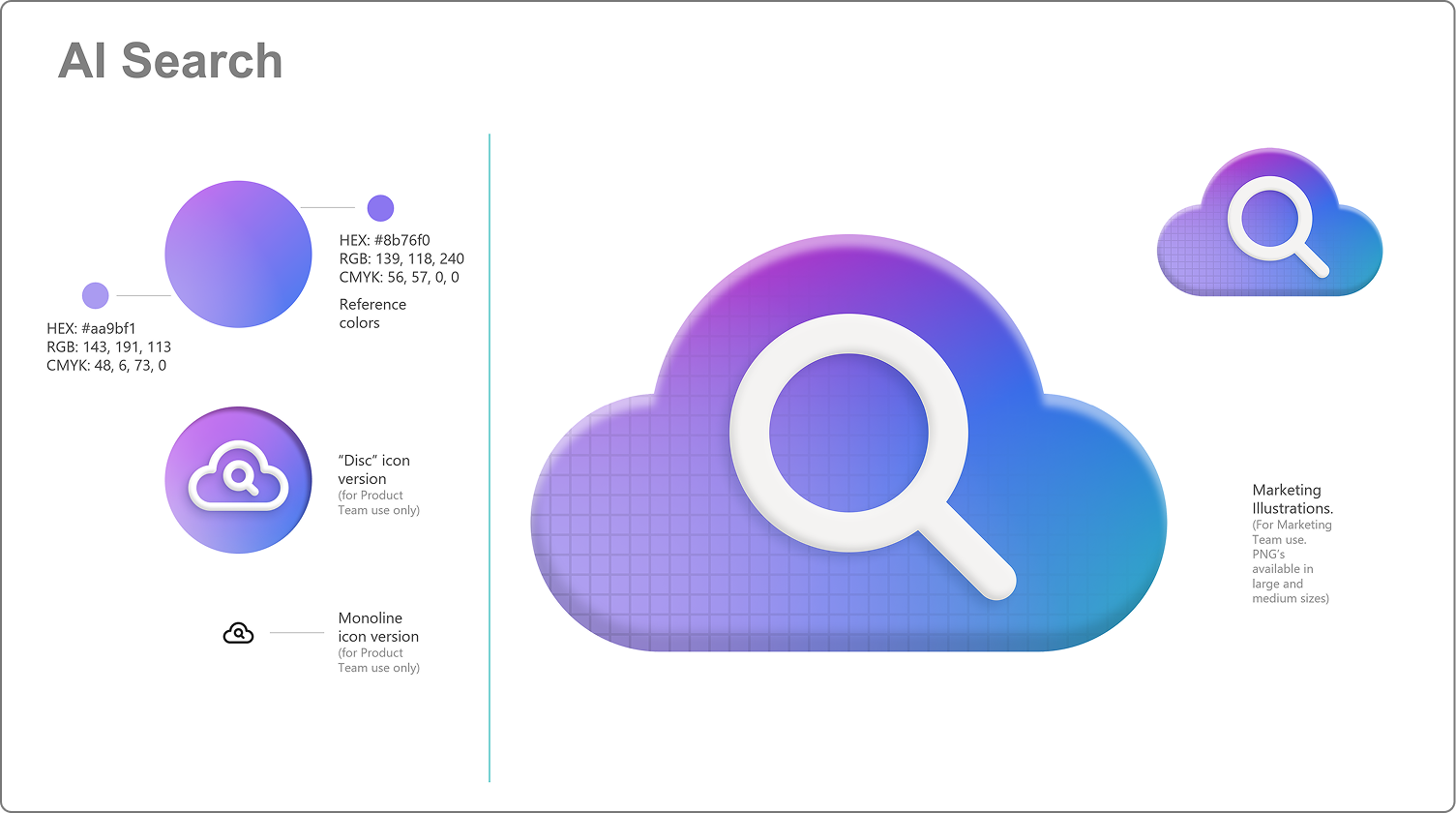
Specifications for each icon were provided to the Marketing Team as part of a kit. Users can grab transparent PNGs and SVG versions of all icons and easily apply them to promotional materials and presentations.


YOU MIGHT BE CURIOUS ABOUT THESE PROJECTS
Sound Transit
OneDrive SharePoint
Thomson Reuters
Microsoft AI Foundry
UW MHCI+D
Microsoft Teams
Microsoft Fluent
Ideation and Storytelling
Big Bold Health
twrk
VISION TO REALITY
Quicken Simplifi
Thomson Reuters
How can we redesign your world? Reach out to us, and let’s get started.
CONNECT
Allovus
8811 N. Harborview Dr. | Suite C | Gig Harbor, WA 98332